
The City of Visalia unveiled their new logo on their Facebook May 7 and the reaction has been less than positive.
Withering criticism has flooded in with comments such as, “This is so sad, it looks like a 5 year old designed it,” and “Just re-checked the calendar…nope, not April 1st.”
In just two days the city’s post has garnered more than 750 comments.
And many Visalian’s want the old logo back.
The city stated in their May 7 Facebook post;
Informed by over 800 conversations, surveys and interviews completed with Visalians, the process has included updating the City’s identity, image, and brand to market the positive aspects of working for and living in the City of Visalia.
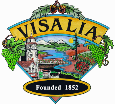
The new City of Visalia logo is a nod to its predecessors with elements breaking out of a bold V. The Fox Theatre represents our beautiful downtown and Visalia’s arts and entertainment scene, as well as the history of our city. The Sierra Nevadas represent the incredible destination Visalia is in the valley under the majestic range, while echoing the strength our city holds. The rolling green hills are the farmland that the city is built on and represent the pride we have in living in the Central Valley. It all rests under a bright blue sky and golden sun.
According to the August 7, 2023 agenda the logo change cost the city $150,000.
The city described the break down of costs in their agenda packet,
“The City currently has a Professional Services Agreement with firm We The Creative to complete the rebranding process for the Human Resources Division, for a contract total of $75,000. Staff is requesting an additional $25,000 from the General Fund for HR Marketing and Branding Services to meet the contract amount (This would be in addition to the $50,000 allocated for FY 2020/2021). Additionally, staff is seeking an allocation of $75,000 for Citywide Rebranding services, which would bring the We The Creative project total for contracted services to $150,000.”
According to the agenda packet the city had started the process of researching into a new city logo in January or February of 2019 but their efforts were delayed by the pandemic. They restarted their project in March of 2021.
The justification for changing the city’s logo was, “Over the years working for a government agency has seen diminished appeal and we need to recreate the vision and develop better ways to market the City. Additionally, the information produced could be used by multiple City departments to present a unified message. This effort has implications for employee attraction and retention as well as economic development efforts.”
We the Creative (WTC) was awarded the contract for the project in April of 2022 through a competitive bid process according to the city.
To create the logo the city said that “WTC met with the City’s project team, taking tours of the community, conducting roundtable discussions and focus groups that included City Council, City staff, residents, business owners, and staff from other stakeholder organizations.”
According to the agenda, “One of the first steps in the branding process was to create a logo that is visually appealing, recognizable, and representative of Visalia. The input received during discovery indicated it should be simple, artistic, colorful, and modern.”
“The overarching goal is to update the City’s identity, image, and brand to market the positive aspects of working for and living in the City of Visalia, as well as create a cohesive, modern, identifiable look to be used throughout the organization,” stated the agenda.
WTC initially presented 29 logo concept options, which were then narrowed down to a top three after review and input from the internal project team, City department heads, and staff. Council was also provided an opportunity to, individually, review the top options.
From that input, a single concept was selected which is referred to as the “Breaking through the V” option,” said the City.
I’ve worked in medium and large size organizations over the last 40 years, and if there is one clear thing I have learned, it is that: if the best thing your staff can think to do is to change the logo (or change the name, or change the URL / domain name, or change the mission statement or vision statement), then you have incompetent people working for you, and they should be fired.
There are many more things they could have spent $150 thousand on, that would have been actually useful: another police officer, or another firefighter, or some road repairs, or replacing street lamps with LED lighting, or any other myriad of useful things.
These people are bored and dangerous and don’t have leadership willing to reign in their bad ideas.
The new logo lacks the name of our city and is lifeless. The vibrancy of the present logo is absent. The money spent on this project is a disgrace. Our local students would have submitted better designs. Shame on those who made the decision.
Wow, did you all get screwed!!
$150,000
Tour the city, travel expenses, food expenses, salaries to pay for meetings about having a meeting then planning another meeting.
This is such a cooperate money wasting logo. The antithesis of the Visalia I know.
The new logo is terrible!
Terrible, no imagination!
This is disgraceful. 150,000$ for this ? This is a valley pure logo what they heck our you guys thinking not allowing valley pure to have a store in Visalia but then steal there logo concept. Visalia should of voted on a logo change before you decided to spend 150,000